Conversation
Notices
-
Giorgio Comai (giocomai)'s status on Sunday, 21-Jan-2018 13:59:47 CET  Giorgio Comai
I'm looking for an effective way to highlight how much the RUB/USD exchange rate has changed over recent years. I think classic line graph doesn't really convey it, so I tried with a barchart adding lines for the percentage change. Suggestions from the fediverse?
#rstats #dataviz #ggplot2 https://social.giorgiocomai.eu/attachment/19361-
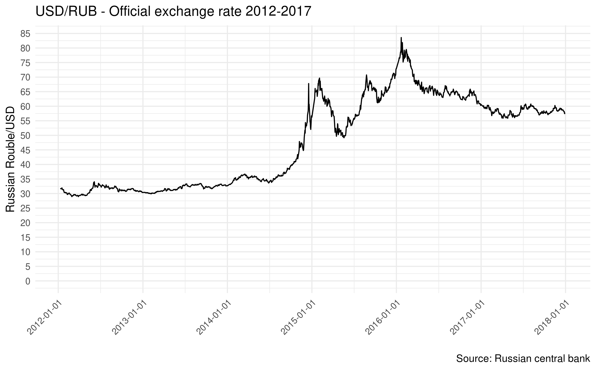
Giorgio Comai (giocomai)'s status on Sunday, 21-Jan-2018 14:00:44 CET
Giorgio Comai
For reference, here is the classic line chart with daily rates for the same period https://social.giorgiocomai.eu/attachment/19362 -
Will Murphy 🌹 (datatitian)'s status on Sunday, 21-Jan-2018 15:49:18 CET  Will Murphy 🌹
@giocomai try mapping the percentage change to y and using the text layer to label the roubles per dollar. That way when a switch from positive to negative is highlighted by a crossing of the x axis
#rstats #dataviz #ggplot2 -
Giorgio Comai (giocomai)'s status on Sunday, 21-Jan-2018 16:04:53 CET
Giorgio Comai
You mean, roughly, something along these lines plus labels for the absolute values? It conveys better the change between negative and positive, but I don't think it really transmits the magnitude of a 50% drop in exchange rate in a single year. Thanks for the feedback! https://social.giorgiocomai.eu/attachment/19367
-